
Trent Okafor deleted the app before he set a single workout goal. Wednesday night. Nashville, Tennessee. Couch, half a bag of pretzels, phone in hand. Three friends had told him this fitness tracker was the one — download it, they said, you’ll see. He didn’t see much. Eleven screens in, somewhere between a permissions request and a paywall nobody warned him about, he closed it. Didn’t reopen it. His trainer had recommended the thing personally. It didn’t matter one bit.
That’s what a broken app onboarding flow actually costs you. It’s rarely dramatic. Nobody storms out. They just go quiet — screen six, screen seven, gone — and you don’t find out until someone on the growth team pulls the retention numbers three weeks later and asks why day-one activation cratered.
We’re not here to hand you another screenshot roundup borrowed from a design blog. This is what we’ve actually watched work — and fail — building mobile app onboarding for clients who genuinely couldn’t afford to lose users at screen four. Call it a working guide to best app onboarding flows 2026, minus the fluff.
Here’s the part that stings a little: most of your user activation rate gets decided before the user has really done anything. Not in the first session — in the first ninety seconds of it. A first-time user experience (FTUE, if you like acronyms) carries more weight than nearly any other screen you’ll ship this year.
Botch the app onboarding UX and you haven’t just lost a download. You’ve paid for that download twice — once for the ad spend, again in the churn that shows up two weeks later, quietly, on a Tuesday, when nobody’s looking. Get it right and something different happens. The flow stops being a hurdle and starts working for you. Fewer support tickets. Faster time to value. People who actually reach that aha moment onboarding teams talk about in standups, instead of bouncing before they’ve seen what the thing even does.
So what’s riding on it, really? A few things, and none of them are small.
Every extra screen you tack onto a new user onboarding sequence bleeds off another slice of people who won’t make it to the next one — the onboarding drop-off rate doesn’t rise gently, it compounds, screen over screen, faster than most teams expect. A flat, uninspired welcome screen design tells a new user “generic app” before you’ve said a single useful thing. Ask for push notification permission, location permission, and camera permission back to back, right at the start, before there’s any reason to trust you — that alone can gut completion. Skip the personalization questions entirely and your app has nothing to tailor later; a marathoner and someone who hasn’t jogged in a decade end up looking at the exact same screens. And leave out a progress indicator? People assume the setup never ends. They bail — not from effort, from not knowing how much is left.
Here’s a belief worth dropping: that onboarding UX design means piling on more screens with slicker animation. It doesn’t. Honestly, the strongest onboarding flow design we’re seeing in 2026 tends to be shorter than what shipped back in 2023. Shorter. Sharper. Built around one real question — what does this particular person need to see before they’ll hand us three more taps of trust?
Progressive onboarding spreads the learning across actual use instead of dumping it all up front. That’s contextual onboarding in practice — a tooltip that shows up the first time someone hovers near a feature, not twelve tooltips fired off in one breathless guided setup that nobody asked for. Duolingo builds this way. So does Notion. The coach mark appears exactly when it matters, then it’s gone, and it doesn’t come back to nag you.
Compare that to function-oriented onboarding, which explains what buttons do, against benefit-oriented onboarding, which shows what you actually get out of it. In just about every test we’ve run for clients, the second one wins — sometimes by a lot. Nobody downloads a habit tracker because they’re curious about streak icons. They download it because they keep missing the gym and they’re tired of it.
Stack an onboarding flow with permission requests right at the entrance and you’ll torch your user activation flow faster than almost anything else we’ve tested. Ask for camera access before anyone understands why, and the app feels invasive within ten seconds of opening it. Hold that permissions onboarding flow until the moment it’s actually needed — a scanning feature, say — and suddenly the same request reads as obviously useful instead of a little creepy.
An app onboarding flow before signup — poke around a bit, log one entry, glance at a sample dashboard full of demo content — earns more trust than any privacy policy link ever will. App onboarding without forced registration is one of the more noticeable shifts we’ve watched over the last couple of years. Calm does it this way. Headspace too. Most of the sharper fintech apps let you feel the product before they’ll take your email address.
Different categories carry different trust burdens, which means app onboarding best practices shift depending on what you’re actually building.
Fintech app onboarding examples lean hard on security — biometric setup, plain language about how data gets used, a signup onboarding flow that explains, clearly, why a Social Security number is even needed before it asks for one. Skip that explanation and abandonment spikes right at the KYC screen. Every time.
Fitness app onboarding examples and health app onboarding examples usually open with a goal selection or interest selection step. Not because it’s trendy right now — because a genuinely personalized onboarding path changes what gets shown next, and people can feel that difference even if they can’t name it.
Ecommerce app onboarding examples tend to skip account creation almost entirely on first touch. Let people browse. Let them save something, build a little intent. Then ask for account setup once there’s actually something worth protecting — a cart with real items in it, say.
Social app onboarding examples live or die on the role selection and interest selection screens, since the whole feed downstream depends on nailing that in the first ninety seconds.
AI app onboarding examples are the newest category we’re building for, and if we’re honest, the hardest. Most users genuinely don’t know what to ask an AI tool to do — that’s the actual problem. The ones getting this right lean on sample data and a short interactive walkthrough that shows one real output before asking the user to type anything at all.
Pull apart any strong mobile app onboarding screen examples and you keep landing on the same handful of pieces, just arranged with more care than most teams bother to give them.
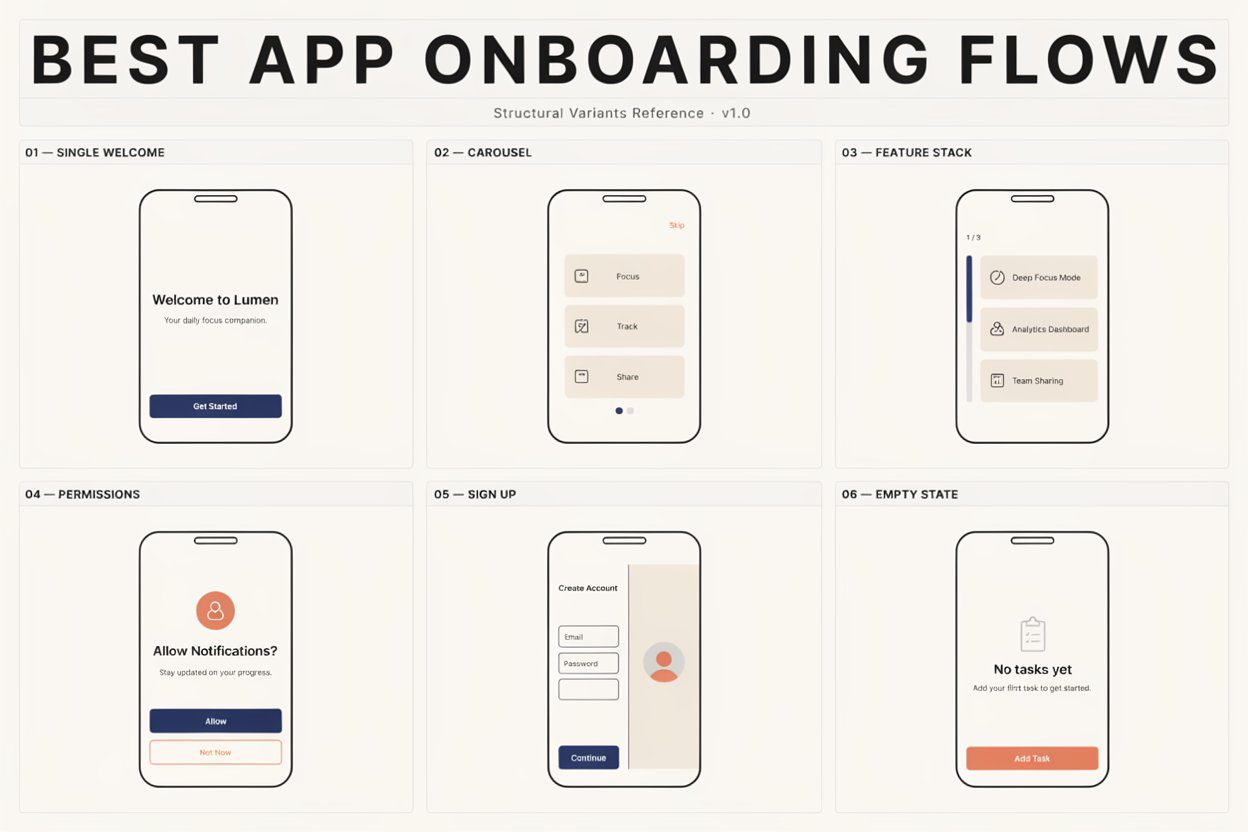
A splash screen that loads in under two seconds and doesn’t linger. A welcome screen built around one clear value statement — one, not three competing for attention. A product tour design capped at three or four cards, each tied to something the user actually gets, not a feature list. A profile setup flow that only asks what’s needed right now and defers the rest for later, when it’s relevant. An onboarding checklist design that shows real progress without making anyone feel bad for skipping a step. And an empty state that hands new users something to do immediately, instead of a blank screen and a cursor blinking at nobody.
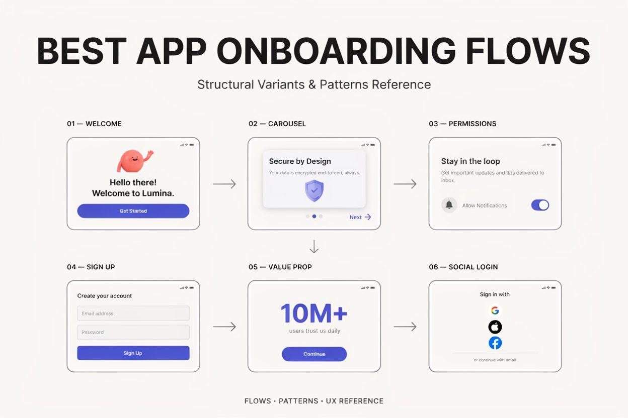
Here’s how that breaks down when you’re auditing your own flow:
| Element | What It Should Do | Common Mistake |
| Welcome screen | State the core value in one sentence | Generic tagline, no specifics |
| Signup / login screen | Offer social login or single sign-on next to email | Forcing manual account creation upfront |
| Permission prompt | Ask contextually, one thing at a time | Batch-requesting camera, location, notifications together |
| Personalization questions | Feed straight into what the user sees next | Collected, then never actually used anywhere |
| Progress indicator | Show how close the user is to finished | Missing entirely — setup feels endless |
| Empty state | Pre-fill with sample data or a quick first win | Blank screen, no obvious next move |
| Paywall placement | Shows up after value’s already been felt | Thrown up before the user’s tried anything |
You don’t need to rebuild the entire onboarding journey from scratch to move the numbers. A handful of targeted changes tend to do most of the work on your onboarding completion rate.
Cut screens before you add features — if a step doesn’t change what happens next, it shouldn’t be there. Push the paywall onboarding flow later, so the first value experience lands before anyone’s asked for a card number. Run onboarding A/B testing on the order of screens, not just the copy on them; sequence matters more than most teams give it credit for. Sit down and actually watch onboarding session replay recordings — ten minutes of watching real people stall on a single screen teaches you more than a week of arguing about it in Slack. Send a short onboarding feedback survey to the people who dropped off partway through, not just the ones who finished; the quitters usually have the sharper answers. And track your onboarding metrics past day one. A real onboarding retention strategy looks at day seven and day thirty, not whether someone tapped through a tutorial once.
There’s no magic number here, no matter what the headlines promise. But across the best user onboarding flow examples we’ve studied, most land somewhere between three and six meaningful steps before the user reaches something they’d call real value. Go past six and you’re usually explaining stuff the interface itself should already be showing. A well-built empty state paired with good sample data teaches faster than another slide ever will — every time we’ve tested it.
We’ve built onboarding flows across fintech, healthtech, ecommerce, and social products for clients who couldn’t afford to bleed users at screen four. Our UI/UX services team handles the onboarding UI design and the onboarding UX examples research behind it, mapping the flow against real user behavior instead of guessing at what feels right. Our mobile app development team — working across iOS, Android, and cross-platform builds — makes sure the flow performs the way it was designed to, not just the way it looked in Figma. Our quality assurance team runs usability passes before launch, so we catch the drop-off points before your users do. If your product needs a customer onboarding flow that doesn’t quietly leak users at screen six, book a free consultation and we’ll walk through what’s broken, and what’s actually worth fixing first.
1. What is the ideal length for a mobile app onboarding flow?
Three to six screens covering real value, nothing extra. Beyond that, most users stop paying attention and either skip everything or leave the app for good.
2. What’s the difference between progressive and upfront onboarding?
Progressive onboarding teaches features as people reach them naturally. Upfront onboarding dumps it all at once, which tends to overwhelm users before trust exists.
3. Should apps ask for permissions during onboarding?
Only with an immediate reason attached. Requesting camera or location access before explaining why is one of the fastest ways to spike drop-off.
4. When should a paywall appear in the onboarding flow?
After the user’s felt real value, never before. An early paywall blocks the first value experience and quietly drags activation rates down.
5. How do you measure onboarding success?
Track completion rate, where people drop off screen by screen, and retention at day seven and day thirty — not just tutorial completion.